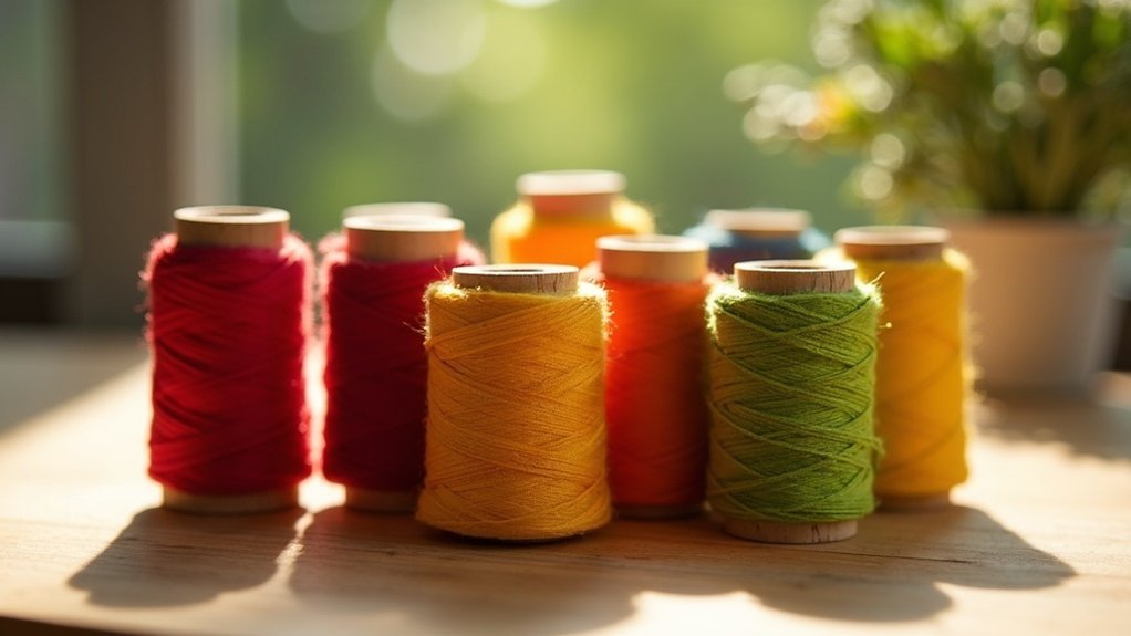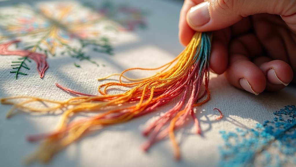

To plan your embroidery color palettes, start with the color wheel to understand primary, secondary, and tertiary colors. Choose a base hue that resonates with you and explore complementary or analogous color schemes for striking contrast or harmony. Organize your threads by color families for easy access, and don’t hesitate to experiment with pre-made palettes for inspiration. Remember, incorporating various shades adds depth. There’s so much more to explore when it comes to color theory!
Key Takeaways
- Start by selecting a base color that resonates with your design vision and emotional intent.
- Utilize the color wheel to explore color relationships and identify complementary or analogous colors.
- Organize thread colors by families for a more streamlined selection process during planning.
- Experiment with pre-made color palettes for inspiration and to visualize potential combinations.
- Incorporate varying shades, tints, and tones to add depth and richness to your embroidery design.
Understanding the Color Wheel
The color wheel is your best friend when it comes to planning embroidery color palettes. It consists of 12 main colors, including primary colors like red, blue, and yellow, which form the foundation for your thread colors. By mixing these, you create secondary colors—green, orange, and purple—and expand your palette with tertiary hues.
Understanding color schemes, such as complementary and analogous colors, allows you to enhance your embroidery projects with harmonious designs. Use the color wheel to identify combinations that work well together, ensuring your creations are visually appealing and serve the purpose of delighting those who receive them.
Exploring Color Schemes
How can you elevate your embroidery projects with color schemes? Choosing colors thoughtfully can transform your designs.
Monochromatic color palettes create a cohesive elegance using various shades of a single hue. If you crave vibrancy, consider complementary color schemes for high contrast that captivates the eye.
Alternatively, explore analogous color schemes, where three adjacent colors harmonize beautifully, adding depth without overwhelming.
Triadic color schemes offer dynamic designs by mixing three evenly spaced colors, infusing energy into your work.
Each approach provides unique visual effects, allowing you to tailor your embroidery to serve your audience’s tastes and create lasting impressions.
Tips for Selecting Color Palettes
Selecting the perfect color palette can make all the difference in your embroidery projects, so start by choosing a base color that resonates with you.
Use the color wheel to explore relationships between colors, whether you prefer smooth shifts with analogous colors or striking contrasts with complementary ones.
Explore the color wheel to discover harmonious relationships, whether through soothing analogous shades or bold complementary contrasts.
Organize your thread colors by color families to simplify the selection process, helping you visualize harmonious combinations.
Don’t hesitate to experiment with pre-made palettes from resources like Stitch Palettes for inspiration.
Ultimately, remember that personal preference is key—select colors that evoke the desired emotional impact for your embroidery masterpiece.
Practical Application of Color Theory
While steering through the world of embroidery, applying color theory can elevate your designs from ordinary to extraordinary. Understanding how colors interact is key; use the color wheel to identify shades that work well together.
Consider using three colors for a balanced, harmonious look. DMC embroidery thread offers a wide range, making it easy to experiment with complementary, analogous, or triadic schemes.
Incorporating shades, tints, and tones adds depth, especially in monochromatic palettes. Practicing with color matching guides can guarantee your hand embroidery projects are pleasing to the eye, resulting in impactful designs that truly serve your audience’s desires.
Resources for Color Inspiration
Finding the right color inspiration can transform your embroidery projects, making them truly standout pieces.
Explore resources like Stitch Palettes, which offers striking color palettes extracted from photos for seamless color selection. Themed e-books provide quick reference for special occasions, while DMC code organization simplifies identifying thread colours.
Utilize color picker tools in graphic software to experiment with combinations. Engaging with online communities, such as the “Stitching and Co” podcast, can yield personal insights and foster creativity.